Challenge: demystify mochi and put it on the map.
We designed a brand in collaboration with Regular Practice that resonates with a western market of culinary-curious foodies whilst nodding to the eastern origins of mochi’s heritage.
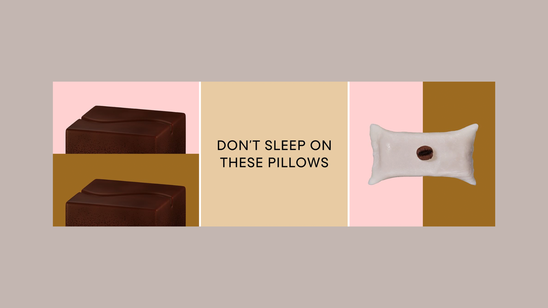
We took a centuries-old Japanese sweet treat and packaged it in a way that feels playful, human and warm — fusing modern mouthfuls with ancient practices.
It was crucial to strike the right tone of voice, something playful but not silly; colourful but not garish. The food start-up scene is so conducive to larger-than-life brand personalities, but we didn’t want to overindulge in puns or try to be too clever with our language.
We kept it relatively simple — like the concept of the snack itself — and leaned into its soft texture. The texture led the creative strategy, this idea that a mochi moment is a mindful moment. There’s something delicate, soothing and ritualistic in the unwrapping of the product and the mouthfeel experience.
We brought this multi-sensory playground to life across copy and creative.