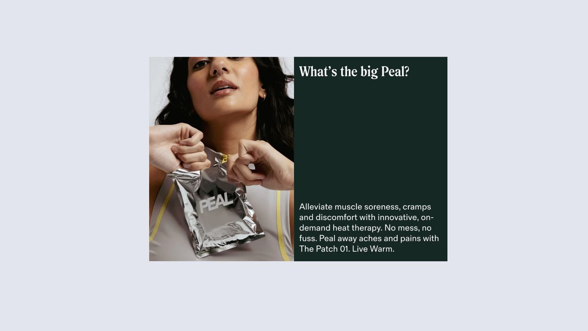
Challenge: own the natural heat patch market with personality and elevated design.
Informed by the brand strategy, our copy is rooted in innovative language that feels techy and intelligent, without coming across as clinical, cold and, well, boring.
We were commissioned by Studio Don to create the copy that lives across packaging, with enough weight to come to life across socials and wider marketing efforts.
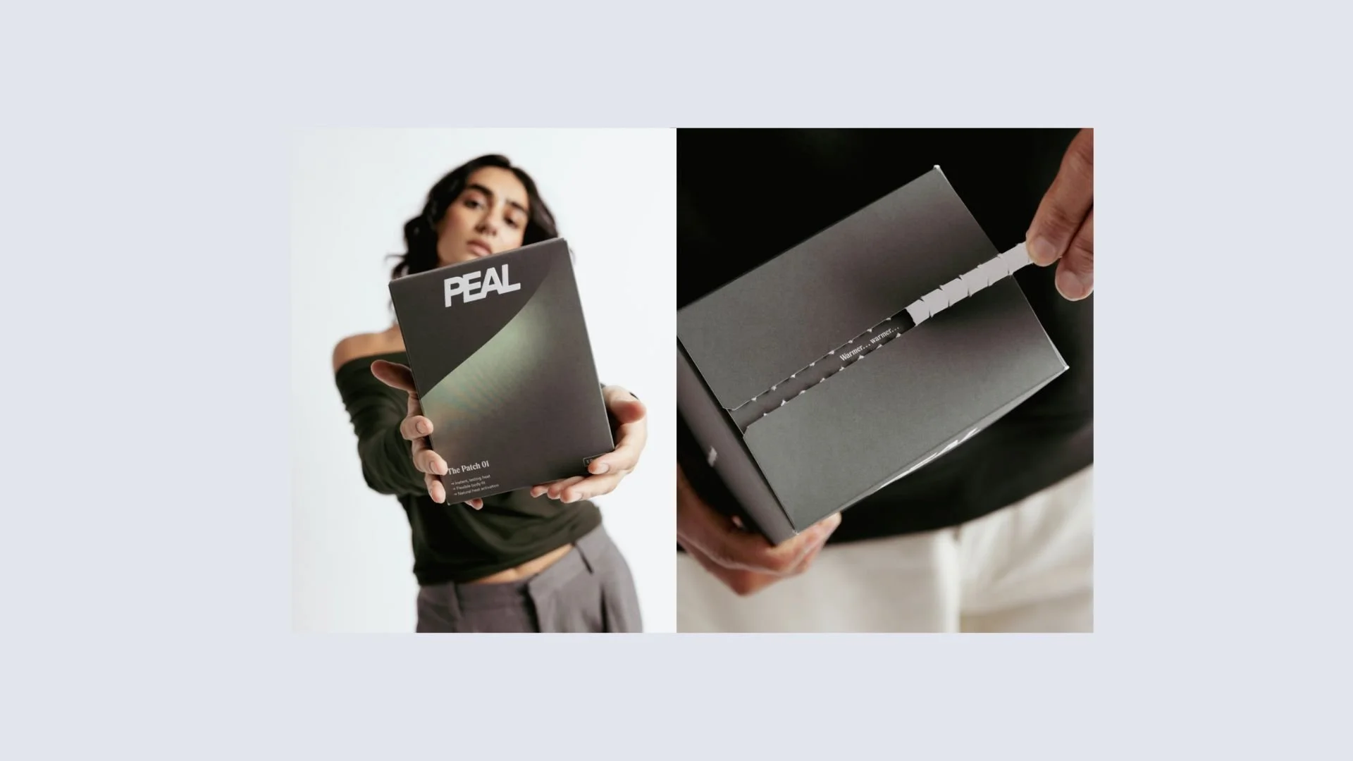
The naming system (Patch 01, Patch 02) borrows from the tech category and reflects the scientific, formulaic approach to product development, and is in itself part of the wider visual branding. Integration of numbers as language embeds us further in this tech space, makes the brand feel smart and informed. When a brand is scientific, we trust it — especially when it’s medical or therapeutic.
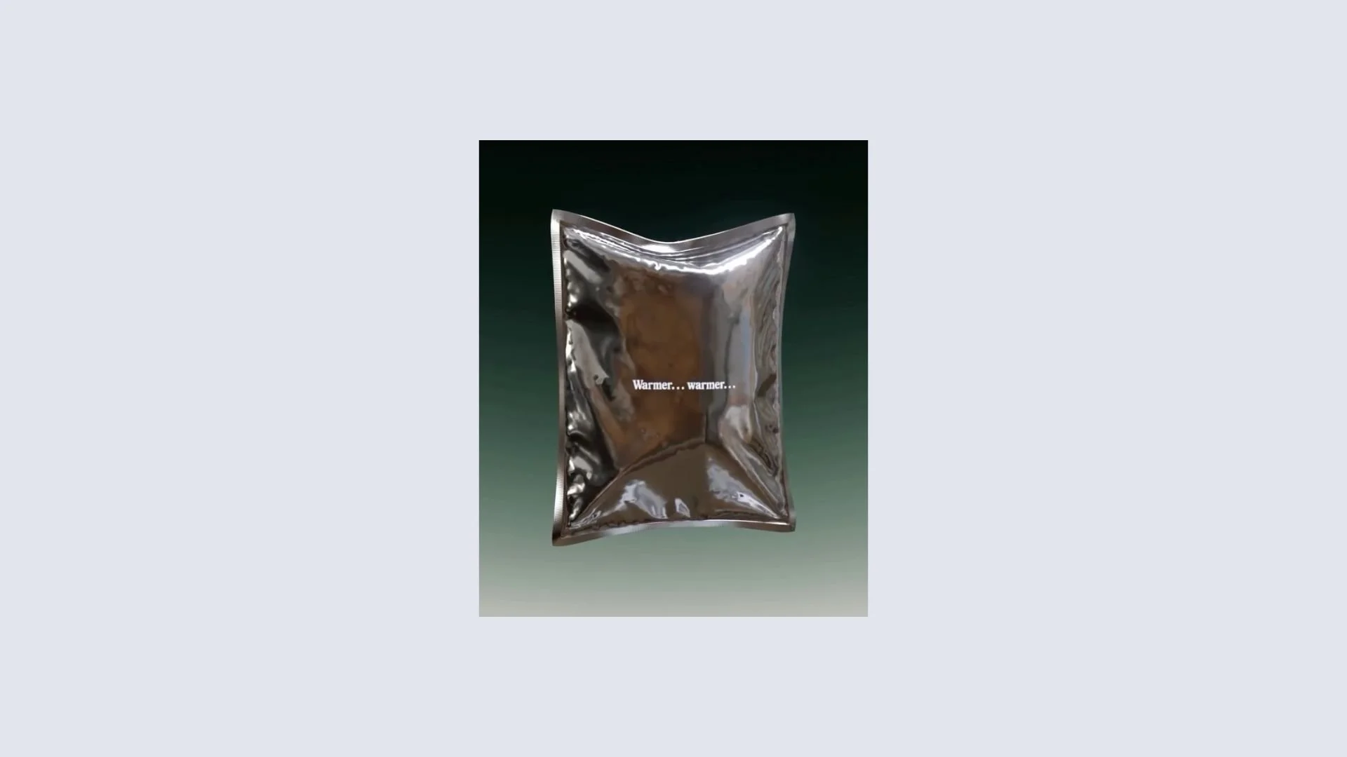
In the spirit of heat pads, we warmed things up with some gentle plays on words, to humanise the brand. While we’re therapeutic, we’re not clinical, so avoided a TOV that sold us in as the latter.